# 彩带
# 出处
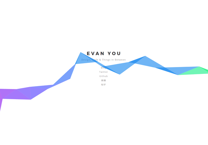
听说最初是尤大佬写在博客的
这里直接贴代码了
# 源码
<canvas></canvas>

<script>
    document.addEventListener('touchmove', function (e) {
        e.preventDefault()
    })
    var c = document.getElementsByTagName('canvas')[0],
        x = c.getContext('2d'),
        pr = window.devicePixelRatio || 1,
        w = window.innerWidth,
        h = window.innerHeight,
        f = 90,
        q,
        m = Math,
        r = 0,
        u = m.PI*2,
        v = m.cos,
        z = m.random
    c.width = w*pr
    c.height = h*pr
    x.scale(pr, pr)
    x.globalAlpha = 0.6
    function i(){
        x.clearRect(0,0,w,h)
        q=[{x:0,y:h*.7+f},{x:0,y:h*.7-f}]
        while(q[1].x<w+f) d(q[0], q[1])
    }
    function d(i,j){
        x.beginPath()
        x.moveTo(i.x, i.y)
        x.lineTo(j.x, j.y)
        var k = j.x + (z()*2-0.25)*f,
            n = y(j.y)
        x.lineTo(k, n)
        x.closePath()
        r-=u/-50
        x.fillStyle = '#'+(v(r)*127+128<<16 | v(r+u/3)*127+128<<8 | v(r+u/3*2)*127+128).toString(16)
        x.fill()
        q[0] = q[1]
        q[1] = {x:k,y:n}
    }
    function y(p){
        var t = p + (z()*2-1.1)*f
        return (t>h||t<0) ? y(p) : t
    }
    document.onclick = i
    document.ontouchstart = i
    i()
</script>
# 三角形绘制
三角形绘制算法步骤如下:
- 设置左起第一个三角形的两个点坐标为:q0 (0,h*.7+f), q1(0,h*.7-f),h为窗口高度,f为初始距离90
- 若q1.x < w+f,取三角形的第三点为q2 (q1.x + (Math.random()*2 - 0.25)*f,q1.y + (Math.random()*2 - 1.1)*f),q2.y如果超过了窗口大小则重新取,直到满足条件为止;否则,结束绘制
- 绘制三角形
- 设置q0 = q1, q1 = q2,重复上述步骤
算法分析:
- 主要是第4步使得每个相连的三角形都有一条共同的边,所以相连
- 最初两个点的y值,以及第三点的取法都是经验值
- q1到q2的x方向增幅为(Math.random()*2 - 0.25)*f,Math.random()2 - 0.25等于[-0.25, 1.75),也就是说三角形的整体走势在x方向上是向右的,偶尔会向左,大小在[0, 1.75f)的范围间随机
- q1到q2的y方向增幅为(Math.random()*2 - 1.1)f,(Math.random()2 - 1.1)等于[-1.1, 0.9),也就是说三角形的整体走势在y方向上更多的概率是向上走的,大小在[0, 1.1f)范围间随机。设置为1.1,我觉得本意是让三角形条能更多地经过内容区。设置为1.3的话,太靠上,不可;设置为1的话,由于左边起点为0.7h,内容区在0.5左右,总体还是太靠下了。尝试了下1.2的效果也还可以
# 取色算法
颜色的取值也是重头戏,看下他是如何取到这么漂亮的颜色的。关键的一条颜色赋值代码如下:
'#'+(v(r)*127+128<<16 | v(r+u/3)*127+128<<8 | v(r+u/3*2)*127+128).toString(16)

其中v = Math.cos,u = 2*Math.PI; r = 0,r = r + Math.PI/25
有个转化,(R,G,B)转成十六进制的颜色值可以用(R << 16 | G << 8 | B).toString(16)。也就是说,上面的颜色取值相当于:
R = cos(r)*127+128;
G = cos(r+2*PI/3)*127+128;
B = cos(r+4*PI/3)*127+128);
那么r的取值范围是什么呢?按着每次迭代Math.PI/25的增幅,这决定于屏幕能绘制多少个三角形。上面分析过,三角形在x方向上的增幅为[-0.25f, 1.75f),那么平均的增幅为0.75f即67.5。假设取一般台式机屏幕的宽度为1440,那么平均可以绘制1440/67.5(20.5)个三角形。 所以,r的取值范围为[0, Math.PI4/5)。每点击一次屏幕,继续绘制下一组三角形,r继续增加。由于余弦函数是周期函数,彩条的颜色也会周期性地出现重复。直接画出图像:
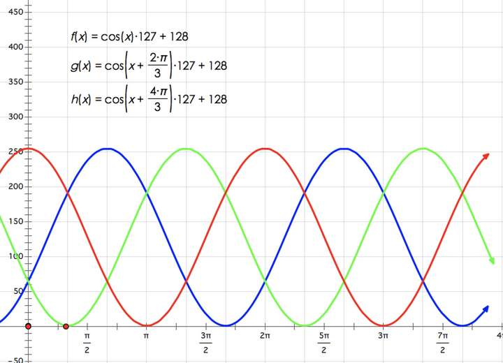
这样就很直观得看到三色的走势,仔细观察页面上的进度条,真的会出现周期性的颜色。
突然,我明白了为什么颜色这么设置了。当然这不是唯一的取色方法。
# 高级版
在cnblog看到有渐变效果的,找了找加载文件,发现了
下面贴下源码
"object" == typeof window && (window.Ribbons = function () {
    var t = window
        , i = document.body
        , n = document.documentElement
        , o = function () {
            if (1 === arguments.length) {
                if (Array.isArray(arguments[0])) {
                    var t = Math.round(o(0, arguments[0].length - 1));
                    return arguments[0][t]
                }
                return o(0, arguments[0])
            }
            return 2 === arguments.length ? Math.random() * (arguments[1] - arguments[0]) + arguments[0] : 0
        }
        , s = function (o) {
            var s = Math.max(0, t.innerWidth || n.clientWidth || i.clientWidth || 0)
                , h = Math.max(0, t.innerHeight || n.clientHeight || i.clientHeight || 0)
                , e = Math.max(0, t.pageXOffset || n.scrollLeft || i.scrollLeft || 0) - (n.clientLeft || 0)
                , a = Math.max(0, t.pageYOffset || n.scrollTop || i.scrollTop || 0) - (n.clientTop || 0);
            return {
                width: s,
                height: h,
                ratio: s / h,
                centerx: s / 2,
                centery: h / 2,
                scrollx: e,
                scrolly: a
            }
        }
        , h = function (t, i) {
            this.x = 0,
            this.y = 0,
            this.set(t, i)
        };
    h.prototype = {
        constructor: h,
        set: function (t, i) {
            this.x = t || 0,
            this.y = i || 0
        },
        copy: function (t) {
            return this.x = t.x || 0,
                this.y = t.y || 0,
                this
        },
        multiply: function (t, i) {
            return this.x *= t || 1,
                this.y *= i || 1,
                this
        },
        divide: function (t, i) {
            return this.x /= t || 1,
                this.y /= i || 1,
                this
        },
        add: function (t, i) {
            return this.x += t || 0,
                this.y += i || 0,
                this
        },
        subtract: function (t, i) {
            return this.x -= t || 0,
                this.y -= i || 0,
                this
        },
        clampX: function (t, i) {
            return this.x = Math.max(t, Math.min(this.x, i)),
                this
        },
        clampY: function (t, i) {
            return this.y = Math.max(t, Math.min(this.y, i)),
                this
        },
        flipX: function () {
            return this.x *= -1,
                this
        },
        flipY: function () {
            return this.y *= -1,
                this
        }
    };
    var e = function (t) {
        this._canvas = null,
            this._context = null,
            this._sto = null,
            this._width = 0,
            this._height = 0,
            this._scroll = 0,
            this._ribbons = [],
            this._options = {
                colorSaturation: "80%",
                colorBrightness: "60%",
                colorAlpha: .65,
                colorCycleSpeed: 6,
                verticalPosition: "center",
                horizontalSpeed: 150,
                ribbonCount: 3,
                strokeSize: 0,
                parallaxAmount: -.5,
                animateSections: !0
            },
            this._onDraw = this._onDraw.bind(this),
            this._onResize = this._onResize.bind(this),
            this._onScroll = this._onScroll.bind(this),
            this.setOptions(t),
            this.init()
    };
    return e.prototype = {
        constructor: e,
        setOptions: function (t) {
            if ("object" == typeof t)
                for (var i in t)
                    t.hasOwnProperty(i) && (this._options[i] = t[i])
        },
        init: function () {
            try {
                this._canvas = document.createElement("canvas"),
                    this._canvas.style.display = "block",
                    this._canvas.style.position = "fixed",
                    this._canvas.style.margin = "0",
                    this._canvas.style.padding = "0",
                    this._canvas.style.border = "0",
                    this._canvas.style.outline = "0",
                    this._canvas.style.left = "0",
                    this._canvas.style.top = "0",
                    this._canvas.style.width = "100%",
                    this._canvas.style.height = "100%",
                    this._canvas.style["z-index"] = "-1",
                    this._canvas.id = "bgCanvas",
                    this._onResize(),
                    this._context = this._canvas.getContext("2d"),
                    this._context.clearRect(0, 0, this._width, this._height),
                    this._context.globalAlpha = this._options.colorAlpha,
                    window.addEventListener("resize", this._onResize),
                    window.addEventListener("scroll", this._onScroll),
                    document.body.appendChild(this._canvas)
            } catch (t) {
                return void console.warn("Canvas Context Error: " + t.toString())
            }
            this._onDraw()
        },
        addRibbon: function () {
            var t = Math.round(o(1, 9)) > 5 ? "right" : "left"
                , i = 1e3
                , n = this._width + 200
                , s = 0
                , e = 0
                , a = "right" === t ? -200 : n
                , r = Math.round(o(0, this._height));
            /^(top|min)$/i.test(this._options.verticalPosition) ? r = 200 : /^(middle|center)$/i.test(this._options.verticalPosition) ? r = this._height / 2 : /^(bottom|max)$/i.test(this._options.verticalPosition) && (r = this._height - 200);
            for (var l = [], c = new h(a, r), _ = new h(a, r), p = null, d = Math.round(o(0, 360)), u = 0; !(i <= 0);) {
                if (i-- ,
                    s = Math.round((1 * Math.random() - .2) * this._options.horizontalSpeed),
                    e = Math.round((1 * Math.random() - .5) * (.25 * this._height)),
                    (p = new h).copy(_),
                    "right" === t) {
                    if (p.add(s, e),
                        _.x >= n)
                        break
                } else if ("left" === t && (p.subtract(s, e),
                    _.x <= -200))
                    break;
                l.push({
                    point1: new h(c.x, c.y),
                    point2: new h(_.x, _.y),
                    point3: p,
                    color: d,
                    delay: u,
                    dir: t,
                    alpha: 0,
                    phase: 0
                }),
                    c.copy(_),
                    _.copy(p),
                    u += 4,
                    d += this._options.colorCycleSpeed
            }
            this._ribbons.push(l)
        },
        _drawRibbonSection: function (t) {
            if (t) {
                if (t.phase >= 1 && t.alpha <= 0)
                    return !0;
                if (t.delay <= 0) {
                    if (t.phase += .02,
                        t.alpha = 1 * Math.sin(t.phase),
                        t.alpha = t.alpha <= 0 ? 0 : t.alpha,
                        t.alpha = t.alpha >= 1 ? 1 : t.alpha,
                        this._options.animateSections) {
                        var i = .1 * Math.sin(1 + t.phase * Math.PI / 2);
                        "right" === t.dir ? (t.point1.add(i, 0),
                            t.point2.add(i, 0),
                            t.point3.add(i, 0)) : (t.point1.subtract(i, 0),
                                t.point2.subtract(i, 0),
                                t.point3.subtract(i, 0)),
                            t.point1.add(0, i),
                            t.point2.add(0, i),
                            t.point3.add(0, i)
                    }
                } else
                    t.delay -= .5;
                var n = this._options.colorSaturation
                    , o = this._options.colorBrightness
                    , s = "hsla(" + t.color + ", " + n + ", " + o + ", " + t.alpha + " )";
                this._context.save(),
                    0 !== this._options.parallaxAmount && this._context.translate(0, this._scroll * this._options.parallaxAmount),
                    this._context.beginPath(),
                    this._context.moveTo(t.point1.x, t.point1.y),
                    this._context.lineTo(t.point2.x, t.point2.y),
                    this._context.lineTo(t.point3.x, t.point3.y),
                    this._context.fillStyle = s,
                    this._context.fill(),
                    this._options.strokeSize > 0 && (this._context.lineWidth = this._options.strokeSize,
                        this._context.strokeStyle = s,
                        this._context.lineCap = "round",
                        this._context.stroke()),
                    this._context.restore()
            }
            return !1
        },
        _onDraw: function () {
            for (var t = 0, i = this._ribbons.length; t < i; ++t)
                this._ribbons[t] || this._ribbons.splice(t, 1);
            this._context.clearRect(0, 0, this._width, this._height);
            for (var n = 0; n < this._ribbons.length; ++n) {
                for (var o = this._ribbons[n], s = o.length, h = 0, e = 0; e < s; ++e)
                    this._drawRibbonSection(o[e]) && h++;
                h >= s && (this._ribbons[n] = null)
            }
            this._ribbons.length < this._options.ribbonCount && this.addRibbon(),
                requestAnimationFrame(this._onDraw)
        },
        _onResize: function (t) {
            var i = s();
            this._width = i.width,
                this._height = i.height,
                this._canvas && (this._canvas.width = this._width,
                    this._canvas.height = this._height,
                    this._context && (this._context.globalAlpha = this._options.colorAlpha))
        },
        _onScroll: function (t) {
            var i = s();
            this._scroll = i.scrolly
        }
    },
        e
}()),
    new Ribbons();
# 大白
# html
<div id="bigwhite">
    <!--头部-->
    <div id="head">
        <div id="eye"></div>
        <div id="eye2"></div>
        <div id="mouth"></div>
    </div>
    <!--躯干-->
    <div id="torso">
        <div id="heart"></div>
    </div>
    <div id="belly">
        <div id="cover"></div>
        <!--和躯干连接处-->
    </div>
    <!--左臂-->
    <div id="left-arm">
        <div id="l-bigfinger"></div>
        <div id="l-smallfinger"></div>
    </div>
    <!--右臂-->
    <div id="right-arm">
        <div id="r-bigfinger"></div>
        <div id="r-smallfinger"></div>
    </div>
    <!--左腿-->
    <div id="left-leg"></div>
    <!--右腿-->
    <div id="right-leg"></div>
</div>
# css
#bigwhite {
    margin: 0 auto;
    height: 600px;
    /*隐藏溢出*/
    overflow: hidden;
}
#head {
    height: 64px;
    width: 100px;
    /*画圆*/
    border-radius: 50%;
    background: #fff;
    margin: 0 auto;
    margin-bottom: -20px;
    border-bottom: 5px solid #e0e0e0;
    /*元素的堆叠顺序*/
    z-index: 100;
    position: relative;
}
#eye,
#eye2 {
    width: 11px;
    height: 13px;
    background: #282828;
    border-radius: 50%;
    position: relative;
    top: 30px;
    left: 27px;
    /*旋转元素*/
    transform: rotate(8deg);
}
#eye2 {
    /*对称旋转*/
    transform: rotate(-8deg);
    left: 69px;
    top: 17px;
}
#mouth {
    width: 38px;
    height: 1.7px;
    background: #282828;
    position: relative;
    top: 10px;
    left: 34px;
}
#torso,
#belly {
    margin: 0 auto;
    height: 200px;
    width: 180px;
    background: #fff;
    border-radius: 47%;
    border: 5px solid #e0e0e0;
    border-top: none;
    z-index: 1;
}
#belly {
    height: 300px;
    width: 245px;
    margin-top: -140px;
    z-index: 5;
}
#heart {
    width: 25px;
    height: 25px;
    border-radius: 50px;
    position: relative;
    /*添加阴影*/
    box-shadow: 2px 5px 2px #ccc inset;
    right: -115px;
    top: 40px;
    z-index: 111;
    border: 1px solid #ccc;
}
#left-arm,
#right-arm {
    height: 270px;
    width: 120px;
    border-radius: 50%;
    background: #fff;
    margin: 0 auto;
    position: relative;
    top: -350px;
    left: -100px;
    transform: rotate(200deg);
    z-index: -1;
}
#right-arm {
    transform: rotate(-200deg);
    left: 100px;
    top: -620px;
}
#l-bigfinger,
#r-bigfinger {
    height: 50px;
    width: 20px;
    border-radius: 50%;
    background: #fff;
    position: relative;
    top: -35px;
    left: 39px;
    transform: rotate(-50deg);
}
#r-bigfinger {
    left: 63px;
    transform: rotate(50deg);
}
#l-smallfinger,
#r-smallfinger {
    height: 35px;
    width: 15px;
    border-radius: 50%;
    background: #fff;
    position: relative;
    top: -70px;
    left: 25px;
    transform: rotate(-40deg);
}
#r-smallfinger {
    background: #fff;
    transform: rotate(40deg);
    top: -70px;
    left: 80px;
}
#left-leg,
#right-leg {
    height: 170px;
    width: 90px;
    border-radius: 40% 30% 10px 45%;
    background: #fff;
    position: relative;
    top: -640px;
    left: -45px;
    transform: rotate(-1deg);
    margin: 0 auto;
    z-index: -2;
}
#right-leg {
    border-radius: 40% 30% 45% 10px;
    position: relative;
    margin: 0 auto;
    top: -810px;
    left: 50px;
    transform: rotate(1deg);
}
# 原理
实现起来并不难,主要用到border-radius
这里有个平时没注意到的知识点
box-shadow: 2px 5px 2px #ccc inset;

x偏移量 | y偏移量 | 阴影模糊半径 | 阴影颜色 | 阴影方向
inset 向内
# canvas验证码
# html
# js
// 随机数
function rn(min, max) {
  return parseInt(Math.random() * (max - min) + min);
}
// 随机颜色
function rc(min, max) {
  var r = rn(min, max);
  var g = rn(min, max);
  var b = rn(min, max);
  return `rgb(${r},${g},${b})`;
}
// 背景颜色,颜色要浅一点
var w = 120;
var h = 40;
var ctx = c1.getContext("2d");
ctx.fillStyle = rc(180, 230);
ctx.fillRect(0, 0, w, h);
// 随机字符串
var pool = "ABCDEFGHIJKLIMNOPQRSTUVWSYZ1234567890";
for (var i = 0; i < 4; i++) {
  var c = pool[rn(0, pool.length)]; //随机的字
  var fs = rn(18, 40); //字体的大小
  var deg = rn(-30, 30); //字体的旋转角度
  ctx.font = fs + "px Simhei";
  ctx.textBaseline = "top";
  ctx.fillStyle = rc(80, 150);
  ctx.save();
  ctx.translate(30 * i + 15, 15);
  ctx.rotate((deg * Math.PI) / 180);
  ctx.fillText(c, -15 + 5, -15);
  ctx.restore();
}
// 随机5条干扰线,干扰线的颜色要浅一点
for (var i = 0; i < 5; i++) {
  ctx.beginPath();
  ctx.moveTo(rn(0, w), rn(0, h));
  ctx.lineTo(rn(0, w), rn(0, h));
  ctx.strokeStyle = rc(180, 230);
  ctx.closePath();
  ctx.stroke();
}
// 随机产生40个干扰的小点
for (var i = 0; i < 40; i++) {
  ctx.beginPath();
  ctx.arc(rn(0, w), rn(0, h), 1, 0, 2 * Math.PI);
  ctx.closePath();
  ctx.fillStyle = rc(150, 200);
  ctx.fill();
}
# 抖音logo
# 分析
抖音 logo 是两个音符 ♪ 叠加、混合而成的。这个音符可以拆分为三个部分:
2和3用border(某些边透明)加圆角50%即可实现
音符合成用到了一个属性
mix-blend-mode
这里用mix-blend-mode: lighten实现
文档可查,这里不深入研究了,都是些ps概念,看不懂
# code
<!DOCTYPE html>
<html lang="en">

<head>
    <meta charset="UTF-8">
    <meta name="viewport" content="width=device-width, initial-scale=1.0">
    <title>Document</title>
    <style>
        body {
            background: #000;
            overflow: hidden;
        }

        .g-container {
            position: relative;
            width: 200px;
            margin: 100px auto;
            filter: contrast(150%) brightness(110%);
        }

        .j {
            position: absolute;
            top: 0;
            left: 0;
            width: 47px;
            height: 218px;
            z-index: 1;
            background: #24f6f0;


        }

        .j::before {
            content: "";
            position: absolute;
            width: 100px;
            height: 100px;
            border: 47px solid #24f6f0;
            border-top: 47px solid transparent;
            border-radius: 50%;
            top: 121px;
            left: -147px;
            transform: rotate(45deg);
        }

        .j::after {
            content: "";
            position: absolute;
            width: 140px;
            height: 140px;
            border: 40px solid #24f6f0;
            border-right: 40px solid transparent;
            border-top: 40px solid transparent;
            border-left: 40px solid transparent;
            top: -110px;
            right: -183px;
            border-radius: 100%;
            transform: rotate(45deg);
            z-index: -10;
        }

        .j:last-child {
            left: 10px;
            top: 10px;
            background: #fe2d52;
            z-index: 100;
            mix-blend-mode: lighten;
            animation: moveLeft 10s infinite;
        }

        .j:last-child::before {
            border: 47px solid #fe2d52;
            border-top: 47px solid transparent;
        }

        .j:last-child::after {
            border: 40px solid #fe2d52;
            border-right: 40px solid transparent;
            border-top: 40px solid transparent;
            border-left: 40px solid transparent;
        }

        @keyframes moveLeft {
            0% {
                transform: translate(200px);
            }

            50% {
                transform: translate(0px);
            }

            100% {
                transform: translate(0px);
            }
        }
    </style>
</head>

<body>
    <div class="g-container">
        <div class="j"></div>
        <div class="j"></div>
    </div>
</body>

</html>
# 波浪百分比
# 分析
这里我简单说明一下关键点:
- 利用
border-radius生成椭圆 - 让椭圆旋转起来
- 并不是利用旋转的椭圆本身生成波浪效果,而是利用它去切割背景,产生波浪的效果。
# code
<!DOCTYPE html>
<html lang="en">

<head>
    <meta charset="UTF-8">
    <meta name="viewport" content="width=device-width, initial-scale=1.0">
    <title>Document</title>
    <style>
        .container {
            position: absolute;
            width: 200px;
            height: 200px;
            padding: 5px;
            border: 5px solid rgb(0, 102, 204);
            top: 50%;
            left: 50%;
            transform: translate(-50%, -50%);
            border-radius: 50%;
            overflow: hidden;
        }

        .wave {
            position: relative;
            width: 200px;
            height: 200px;
            background-color: rgb(51, 102, 204);
            border-radius: 50%;

        }

        .wave::before,
        .wave::after {
            content: "";
            position: absolute;
            width: 400px;
            height: 400px;
            top: 0;
            left: 50%;
            background-color: rgba(255, 255, 255, 0.4);
            border-radius: 45%;
            transform: translate(-50%, -70%) rotate(0);
            animation: rotate 6s linear infinite;
            z-index: 10;
        }

        .wave::after {
            border-radius: 47%;
            background-color: rgba(255, 255, 255, 0.9);
            transform: translate(-50%, -70%) rotate(0);
            animation: rotate 10s linear -5s infinite;
            z-index: 20;
        }

        @keyframes rotate {
            50% {
                transform: translate(-50%, -73%) rotate(180deg);
            }

            100% {
                transform: translate(-50%, -70%) rotate(360deg);
            }
        }
    </style>
</head>

<body>
    <div class="container">
        <div class="wave"></div>
    </div>
</body>

</html>
# 充电效果
# 分析
画一个电池
增加阴影及颜色的变化(使用
filter: hue-rotate()对渐变色彩进行色彩过渡变换动画)添加波浪,这里用一张动图说明(结合上个
波浪百分比,相信你很快就明白了)
# code
<!DOCTYPE html>
<html lang="en">

<head>
    <meta charset="UTF-8">
    <meta name="viewport" content="width=device-width, initial-scale=1.0">
    <title>Document</title>
    <style>
        html,
        body {
            width: 100%;
            height: 100%;
            display: flex;
            background: #e4e4e4;
        }

        .container {
            position: relative;
            width: 140px;
            margin: auto;
        }

        .header {
            position: absolute;
            width: 26px;
            height: 10px;
            left: 50%;
            top: 0;
            transform: translate(-50%, -10px);
            border-radius: 5px 5px 0 0;
            background: rgba(255, 255, 255, 0.88);
        }

        .battery-copy {
            position: absolute;
            top: 0;
            left: 0;
            height: 220px;
            width: 140px;
            border-radius: 15px 15px 5px 5px;
            overflow: hidden;
        }

        .battery {
            position: relative;
            height: 220px;
            box-sizing: border-box;
            border-radius: 15px 15px 5px 5px;
            box-shadow: 0 0 5px 2px rgba(255, 255, 255, 0.22);
            background: #fff;
            z-index: 1;
        }

        .battery::after {
            content: "";
            position: absolute;
            left: 0;
            right: 0;
            bottom: 0;
            top: 80%;
            background: linear-gradient(to bottom,
                    #7abcff 0%,
                    #00bcd4 44%,
                    #2196f3 100%);
            border-radius: 0px 0px 5px 5px;
            box-shadow: 0 14px 28px rgba(33, 150, 243, 0),
                0 10px 10px rgba(9, 188, 215, 0.08);
            animation: charging 10s linear infinite;
            filter: hue-rotate(90deg);
        }

        .g-wave {
            position: absolute;
            width: 300px;
            height: 300px;
            background: rgba(255, 255, 255, 0.8);
            border-radius: 45% 47% 44% 42%;
            bottom: 25px;
            left: 50%;
            transform: translate(-50%, 0);
            z-index: 1;
            animation: move 10s linear infinite;
        }

        .g-wave:nth-child(2) {
            border-radius: 38% 46% 43% 47%;
            transform: translate(-50%, 0) rotate(-135deg);
        }

        .g-wave:nth-child(3) {
            border-radius: 42% 46% 37% 40%;
            transform: translate(-50%, 0) rotate(135deg);
        }

        @keyframes charging {
            50% {
                box-shadow: 0 14px 28px rgba(0, 150, 136, 0.83),
                    0px 4px 10px rgba(9, 188, 215, 0.4);
            }

            95% {
                top: 5%;
                filter: hue-rotate(0deg);
                border-radius: 0 0 5px 5px;
                box-shadow: 0 14px 28px rgba(4, 188, 213, 0.2),
                    0 10px 10px rgba(9, 188, 215, 0.08);
            }

            100% {
                top: 0%;
                filter: hue-rotate(0deg);
                border-radius: 15px 15px 5px 5px;
                box-shadow: 0 14px 28px rgba(4, 188, 213, 0),
                    0 10px 10px rgba(9, 188, 215, 0.4);
            }
        }

        @keyframes move {
            100% {
                transform: translate(-50%, -160px) rotate(720deg);
            }
        }
    </style>
</head>

<body>
    <div class="container">
        <div class="header"></div>
        <div class="battery">
        </div>
        <div class="battery-copy">
            <div class="g-wave"></div>
            <div class="g-wave"></div>
            <div class="g-wave"></div>
        </div>
    </div>
</body>

</html>
# 知乎(老版本)首页动态粒子效果背景
# 思路
涉及到的知识点主要是:canvas、ES6、requestAnimationFrame
大致思路就是:
定义一个类,创建圆和线的实例
设置单个粒子的随机 x,y 坐标和圆圈的半径。使用
window.innerWidth和window.innerHeight获取屏幕宽高,圆的大小设置在一定范围内随机使用
canvas的 api 进行绘制粒子(圆圈)和粒子之间连线,设置一个范围,在此范围内的粒子圆心到圆心通过直线连接让粒子在屏幕范围内移动
置鼠标的交互事件,相当于以鼠标位置的 x,y 坐标为圆心,固定或随机值为半径重新创建了一个粒子,并且也在一定范围内也设置和其他粒子的连线(同第二步)
定义一个变量用来存储生成的圆,遍历它,创建实例;
使用
requestAnimationFrame让所有圆动起来
# html
<canvas id="canvas"></canvas>
# css
html {
  height: 100%;
}
body {
  margin: 0;
  height: 100%;
  background: #fff;
}
canvas {
  display: block;
  width: 100%;
  height: 100%;
}
# js
class Circle {
  //创建对象
  //以一个圆为对象
  //设置随机的 x,y坐标,r半径,_mx,_my移动的距离
  //this.r是创建圆的半径,参数越大半径越大
  //this._mx,this._my是移动的距离,参数越大移动
  constructor(x, y) {
    this.x = x;
    this.y = y;
    this.r = Math.random() * 10;
    this._mx = Math.random();
    this._my = Math.random();
  }

  //canvas 画圆和画直线
  //画圆就是正常的用canvas画一个圆
  //画直线是两个圆连线,为了避免直线过多,给圆圈距离设置了一个值,距离很远的圆圈,就不做连线处理
  drawCircle(ctx) {
    ctx.beginPath();
    //arc() 方法使用一个中心点和半径,为一个画布的当前子路径添加一条弧。
    ctx.arc(this.x, this.y, this.r, 0, 360);
    ctx.closePath();
    ctx.fillStyle = "rgba(204, 204, 204, 0.3)";
    ctx.fill();
  }

  drawLine(ctx, _circle) {
    let dx = this.x - _circle.x;
    let dy = this.y - _circle.y;
    let d = Math.sqrt(dx * dx + dy * dy);
    if (d < 150) {
      ctx.beginPath();
      //开始一条路径,移动到位置 this.x,this.y。创建到达位置 _circle.x,_circle.y 的一条线:
      ctx.moveTo(this.x, this.y); //起始点
      ctx.lineTo(_circle.x, _circle.y); //终点
      ctx.closePath();
      ctx.strokeStyle = "rgba(204, 204, 204, 0.3)";
      ctx.stroke();
    }
  }

  // 圆圈移动
  // 圆圈移动的距离必须在屏幕范围内
  move(w, h) {
    this._mx = this.x < w && this.x > 0 ? this._mx : -this._mx;
    this._my = this.y < h && this.y > 0 ? this._my : -this._my;
    this.x += this._mx / 2;
    this.y += this._my / 2;
  }
}
//鼠标点画圆闪烁变动
class currentCirle extends Circle {
  constructor(x, y) {
    super(x, y);
  }

  drawCircle(ctx) {
    ctx.beginPath();
    //注释内容为鼠标焦点的地方圆圈半径变化
    //this.r = (this.r < 14 && this.r > 1) ? this.r + (Math.random() * 2 - 1) : 2;
    this.r = 8;
    ctx.arc(this.x, this.y, this.r, 0, 360);
    ctx.closePath();
    //ctx.fillStyle = 'rgba(0,0,0,' + (parseInt(Math.random() * 100) / 100) + ')'
    ctx.fillStyle = "rgba(255, 77, 54, 0.6)";
    ctx.fill();
  }
}
//更新页面用requestAnimationFrame替代setTimeout
window.requestAnimationFrame =
  window.requestAnimationFrame ||
  window.mozRequestAnimationFrame ||
  window.webkitRequestAnimationFrame ||
  window.msRequestAnimationFrame;

let canvas = document.getElementById("canvas");
let ctx = canvas.getContext("2d");
let w = (canvas.width = canvas.offsetWidth);
let h = (canvas.height = canvas.offsetHeight);
let circles = [];
let current_circle = new currentCirle(0, 0);

let draw = function() {
  ctx.clearRect(0, 0, w, h);
  for (let i = 0; i < circles.length; i++) {
    circles[i].move(w, h);
    circles[i].drawCircle(ctx);
    for (j = i + 1; j < circles.length; j++) {
      circles[i].drawLine(ctx, circles[j]);
    }
  }
  if (current_circle.x) {
    current_circle.drawCircle(ctx);
    for (var k = 1; k < circles.length; k++) {
      current_circle.drawLine(ctx, circles[k]);
    }
  }
  requestAnimationFrame(draw);
};

let init = function(num) {
  for (var i = 0; i < num; i++) {
    circles.push(new Circle(Math.random() * w, Math.random() * h));
  }
  draw();
};
window.addEventListener("load", init(60));
window.onmousemove = function(e) {
  e = e || window.event;
  current_circle.x = e.clientX;
  current_circle.y = e.clientY;
};
window.onmouseout = function() {
  current_circle.x = null;
  current_circle.y = null;
};
# 注释
本篇绝大部分代码为复制粘贴
出处https://mp.weixin.qq.com/s/v6FWeoaksvrP4vVto4j_WQ